Recommendation Feature

Roblox offers billions of experiences, and users still found themselves bored, unsure what to explore, and eventually closing the app. Rebuilding the game leaving page around recommendations cut the steps to new content by 60%.

Role
Sole designer, product design intern @ Roblox
Timeline
May 2024 – Aug 2024
Collaborators
2 PMs, 1 engineer, 1 UXR, and designers from 4 other teams
Skills
Product audit, Workshop facilitation, Prototyping, User testing
Background

The boredom in the discovery journey

Roblox offers billions of experiences, games and features to help users discover content on the platform. Users still found themselves feeling bored, not knowing what to explore, and eventually closing the app.

Breaking down why they dropped off: 54% for game-related reasons, 30% for social reasons, 16% for other reasons. What that pointed to was that the main reasons for drop-off were boredom, and not knowing what to do next once that boredom set in.

So the question became: how might we re-engage users and capture their attention when they’re feeling bored? To address it, I decided to revive users’ attention by combating boredom and providing new content to reignite their discovery journey.

54%
Game-related reasons
30%
Social reasons
16%
Other reasons
Research

27 products, and a feature with no obvious home

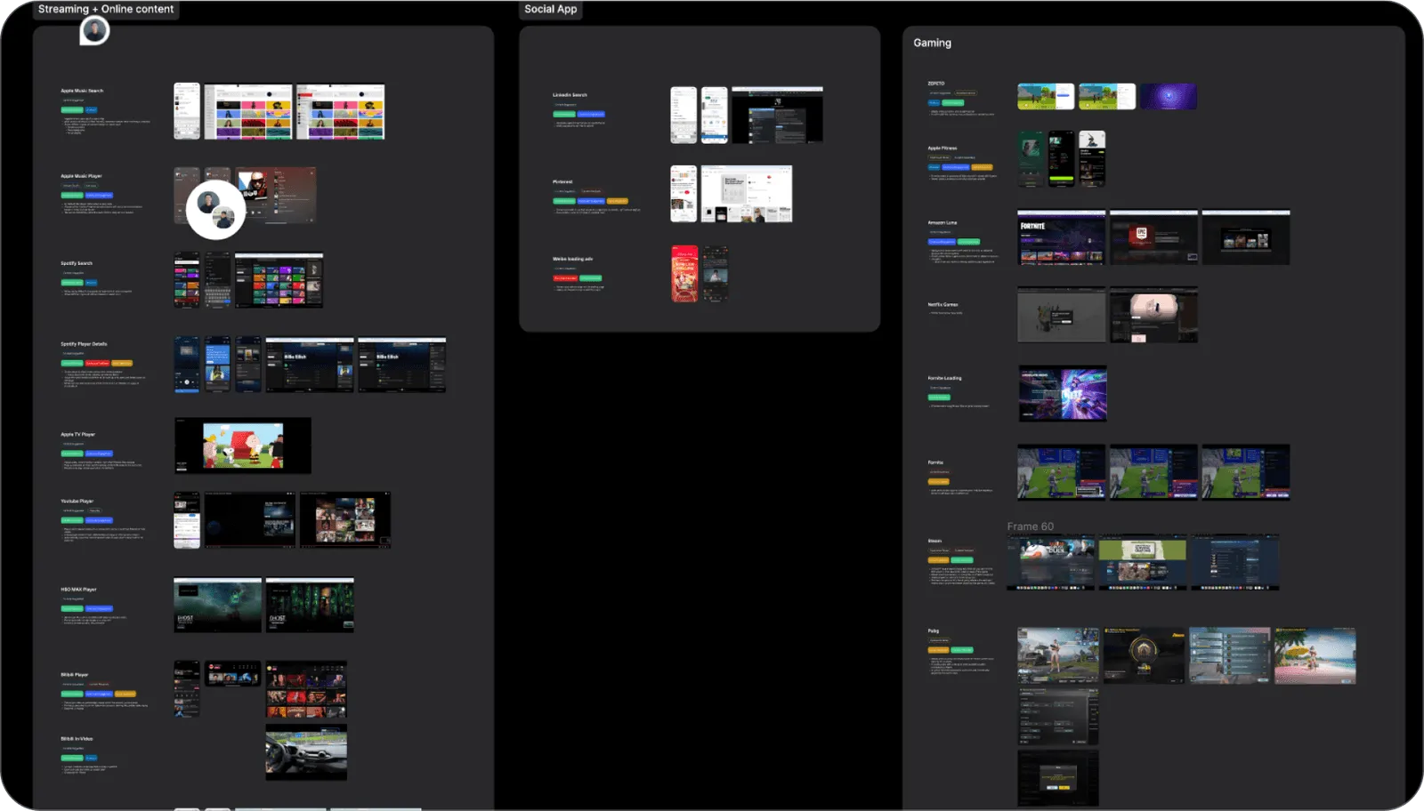
To better understand how to revive users from boredom, I ran a visual audit of 27 similar competitors and synthesized the common design patterns, looking at how different apps use content strategies to combat boredom and re-engage users during discovery.

Two things came out of it. Most of the apps use similar-content recommendation to hold engagement. And the feature has various potential entry points across the current user flow — so where it belonged was still an open question.

Competitor audit — 27 products
Alignment

The opportunity reached past my own team

Based on those audit takeaways, I realized the potential for re-engagement content extended beyond the Discovery team. So I reached out to product managers and designers from four other teams and outlined the potential re-engagement content options that could prevent user churn.

To take the collaboration further and consolidate those options, I hosted a workshop with designers from the four teams, which gathered ideas for re-engaging users from each team’s own perspective and content.

The takeaway: social and switching-server features had high demand from both the user and the business side.

Cross-team workshop — designers from four teams
Decision

The game leaving page

Once I had gathered the insights and ideas for potential features and patterns, I analyzed the current user flow to identify the best entry point for the recommendation feature. On the flow map I highlighted the potential drop-off points, and proposed against each one the corresponding features — drawn from the competitor audit and the brainstorming session — that could improve re-engagement.

The game leaving page had the highest user drop-off rate, and the re-engagement opportunity to match. So that is where I decided to implement the recommendation feature.

User flow map — drop-off points and proposed features
Design

From sketches to prototypes

Working from the ideas gathered in the workshop, I started to visualize the core features and iterated through several designs, from low-fidelity sketches to high-fidelity prototypes, with input from PMs and engineers.

Major iteration treatments
Platforms

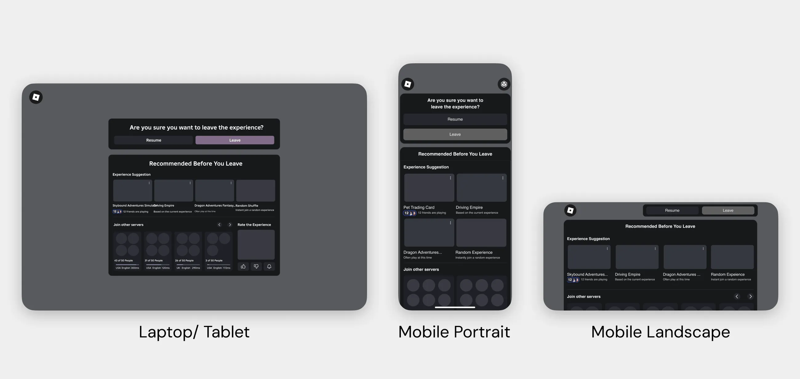
Another challenge — three device classes

Roblox products span mobile, console and VR, so the next problem was designing for all of them. I adapted the designs to fit the various screen sizes, so the experience stayed unified across the range of devices Roblox users are actually on.

Cross-platform — laptop/tablet, mobile portrait, mobile landscape
Testing

Random shuffle, surprisingly

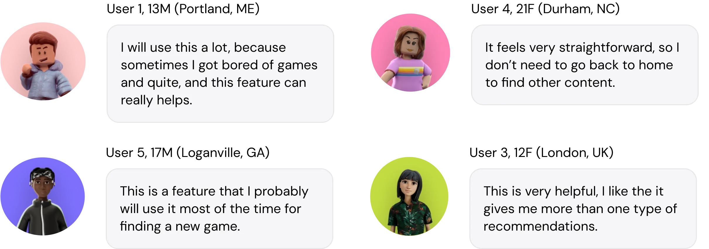
To validate the design I ran 9 user testing sessions with a UX researcher, across 10 users. I showed them the different design treatments and asked how they read the new design. The sessions validated many of my decisions, and I iterated on the design from their feedback.

Users were highly positive on the new recommendation feature on the leaving page. Surprisingly, the “random shuffle” feature emerged as their top favorite.

Usability testing — 9 sessions, 10 users
Final design

UpNext Recommendation

Based on the user testing feedback and internal design critiques, I iterated on the final design, and prototyped the Random Shuffle feature in Protopie to explore its micro-interactions and transition screens.

What I delivered was a comprehensive UpNext Recommendation feature across laptop, mobile and VR.

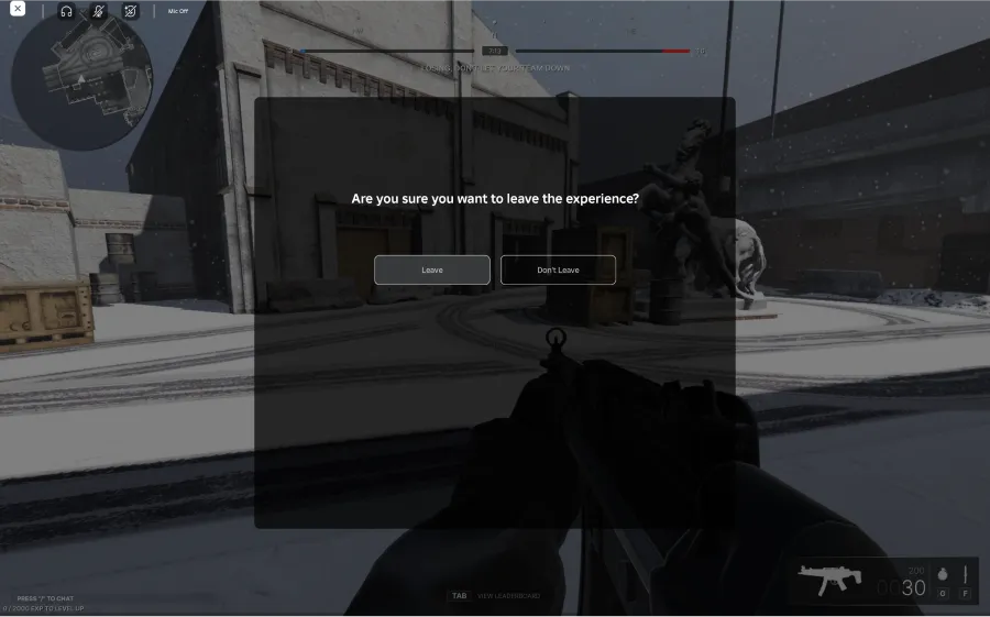
BeforeThe original leave dialog — a confirmation question with Leave and Don't Leave buttons, and nothing else.
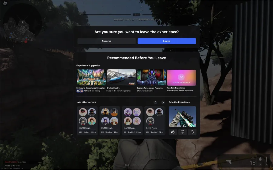
AfterThe redesigned leave flow — the same confirmation, followed by a Recommended Before You Leave panel of experience suggestions, other servers to join, and a rating prompt.
Outcome

The project streamlined the process for users to discover new games at the end of each play session, making it 60% faster to reach their next piece of content.

It spans content across four teams, and the design created a unified interface to accommodate that diverse content — built to stay consistent and functional across laptop, mobile and VR screens.

60%
Faster to next content
4
Teams’ content unified
3
Platforms designed for
Reflection
  • Design can lead a project

    It can spark meaningful conversations across teams. Here my design influenced five project teams, and facilitated the discussions that drove the transition from ideas into development.

  • Breadth and depth

    I learned to design across both — collaborating with different teams on a wide range of content, while also working on detailed aspects such as implementing algorithms in the content layout.

  • Data aligns as well as informs

    I leaned on user testing and data to inform my design decisions. That shaped the design itself, but it was also a powerful tool for aligning with stakeholders.

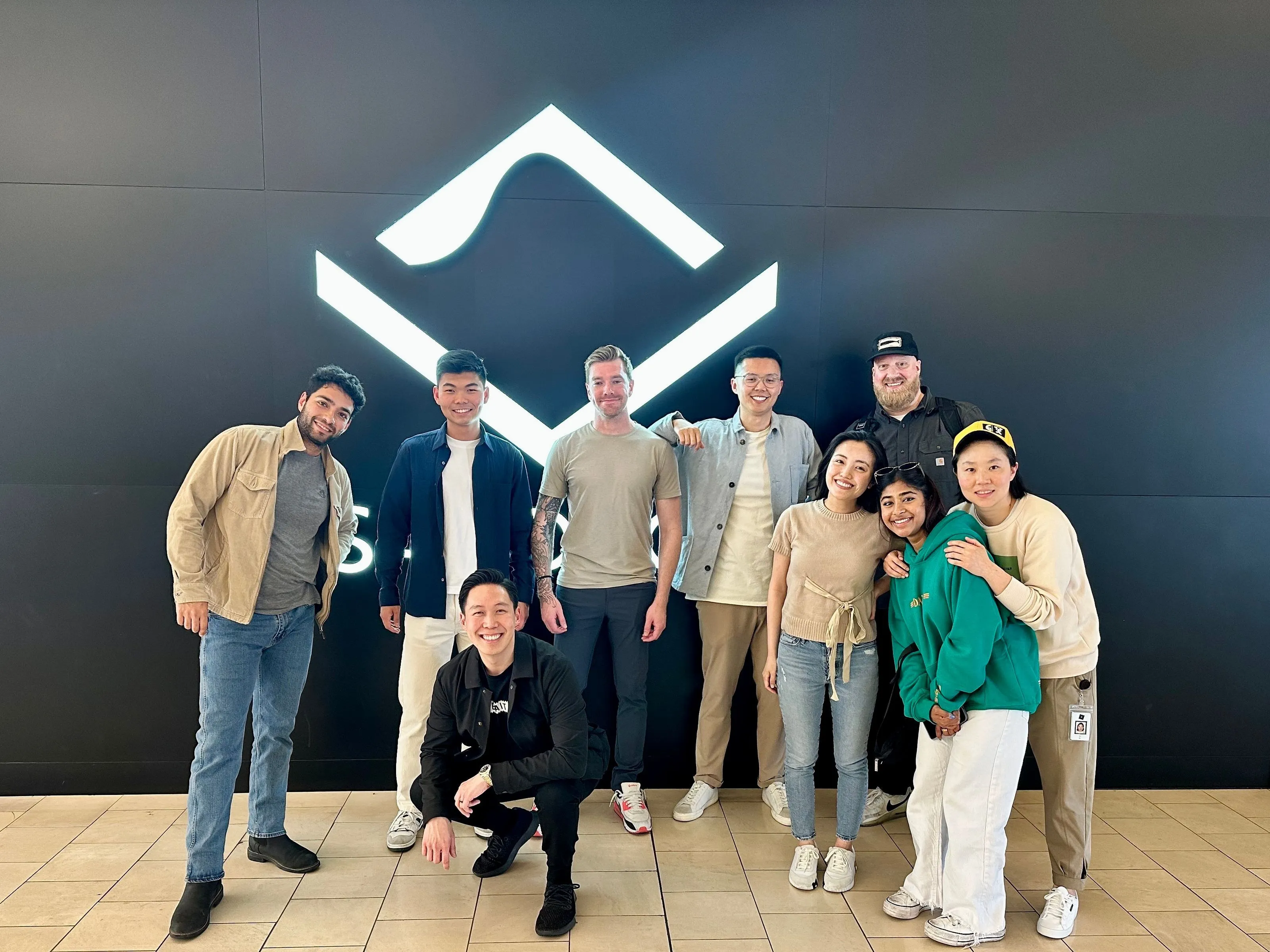
The team I worked with at Roblox
Back to work
Menu

This project is password protected

This case study covers work under NDA. Enter the password to read it.

Reach out for the password